

You’ve built your website, shared it with the world, and waited for the leads to roll in. But instead, you’re hearing crickets. Sound familiar? You’re definitely not alone, and the good news is that a few simple tweaks can completely change the game.
Here’s the truth: getting people to visit your website is only half the battle. The real magic happens when those visitors actually take action, whether that’s filling out a contact form, signing up for your newsletter, or picking up the phone to call you. That’s what conversion is all about.
In this post, we’re diving into practical small business website conversion tips that anyone can implement, even if you’re not a tech wizard or a marketing expert. No complicated jargon, no overwhelming strategies. Just straightforward, beginner-friendly advice that can start making a difference right away.
By the time you finish reading, you’ll have 10 actionable ideas to transform your website from a digital brochure into a genuine lead-generating machine. Let’s get into it!
1. Speed Up Your Site Before Anything Else
Let’s start with the uncomfortable truth: your website might be losing customers before they ever read a single word on it.
A 1-second delay in page load time reduces conversions by 7%. On mobile, that penalty jumps to as much as 20% per second. And here’s the kicker: the average mobile page load time sits around 8.6 seconds in 2026, while 47% of consumers expect a site to load in under 2 seconds and 40% will simply leave if it takes longer than 3. That gap is where your leads are quietly disappearing.
The good news is that several quick wins can close that gap without a full site rebuild. Start by compressing your images using free tools like Squoosh or ShortPixel, since oversized images are consistently the single highest-impact culprit slowing sites down. Enable browser caching so returning visitors load your pages faster, minimize unused JavaScript that clogs up your main thread, and consider adding a content delivery network (CDN) to serve your site files from servers closer to your local visitors.
Once you’ve made a few changes, head over to Google PageSpeed Insights for a free, scored audit that tells you exactly what’s broken and which fixes matter most.
Speed also isn’t just a user experience problem. Google uses Core Web Vitals as a confirmed ranking signal, meaning a slow site suppresses your search visibility and your conversion rate at the same time. Only 42% of websites currently pass Core Web Vitals, so fixing your speed is genuinely one of the fastest ways to pull ahead of local competitors.
2. Design for Mobile Conversion, Not Just Mobile Compatibility
Over 54.8% of small business website traffic comes from mobile devices, yet the majority of small business sites still take a “shrink and hope” approach to mobile. They take a desktop layout, squeeze it onto a smaller screen, and call it mobile-friendly. That is not the same as designing a mobile experience that actually converts visitors into customers.
Mobile-first conversion architecture in 2026 means starting your design process on the smallest screen first and building up from there. Think about every element at a 375-pixel width: Are your buttons large enough to tap without frustration? Is your contact form short enough that someone filling it out with one thumb won’t give up? Is your most important call-to-action visible without scrolling at all?
Here are the three mobile conversion elements that matter most for small businesses:
- A click-to-call button above the fold. If someone finds your site on their phone, they should be able to call you in one tap without hunting for your number.
- A contact form with three fields maximum. Name, phone or email, and one question. Anything longer kills completions.
- A sticky header with your primary CTA. This follows the user as they scroll, keeping your next step in front of them the entire time.
One thing to avoid completely: full-screen pop-ups on mobile. Google penalizes intrusive interstitials in its search rankings, and real visitors abandon sites that block content on small screens.
The best way to audit your mobile experience is refreshingly simple. Pick up your own phone, go to your site as if you were a stranger trying to contact your business, and note every moment of friction you encounter. You will find the problems faster than any tool can. Conversion-focused web design starts with honestly experiencing what your visitors experience.
3. Put Trust Signals Where Visitors Look First
Here’s something most small business owners don’t realize: your visitors have already formed an opinion about your business before they read a single word of your copy.
Research shows that 94% of first impressions are design-related, and 75% of consumers judge a company’s credibility based on its website design. That judgment happens in roughly 50 milliseconds, which is faster than a blink. If your site looks unpolished or generic, visitors apply a credibility discount to everything that follows, including your testimonials, pricing, and call-to-action buttons.
The fix isn’t a full redesign. It’s strategic placement of trust signals where visitors actually look first.
What belongs above the fold on a small business homepage:
- Star ratings with a visible review count (aim for 10+ reviews as a minimum trust threshold)
- Recognizable badge logos such as BBB accreditation, Google reviews badges, or industry certifications
- Years in business, displayed simply as “Serving [City] Since 2011”
- A professional headshot or real team photo (team photos alone can boost trust scores by up to 33%)
- A physical address and phone number (adding these increases perceived trustworthiness by approximately 35%)
According to website trust signal statistics for 2026, adding trust signals in the right places can lift conversions by up to 42%. That is not a footer tweak. That is a structural design decision.
One of the highest-impact moves you can make is placing a single testimonial directly beneath your homepage headline. It needs to include a real full name, a photo, and a specific outcome rather than vague praise. “Great service!” does almost nothing. “Sarah helped us book 14 new clients in our first month” does a lot. Photo-backed reviews generate 38% more trust than text-only versions.
Finally, if your reviews are currently living on a standalone “Testimonials” page, move at least two or three onto your homepage and your primary service pages. That is where visitors are deciding whether to contact you, and trust signals need to be present at the exact moment the decision is being made.
4. Fix Your First Impression With Intentional Design
You only get one chance to make a first impression, and on your website, that window is incredibly small. Research shows visitors form an opinion about your site in just 0.05 seconds, and 94% of that snap judgment is based entirely on design. Not your headline. Not your offer. Just how your page looks the moment it loads.
That means a cluttered layout, mismatched fonts, or an outdated color scheme can quietly kill your credibility before a single word gets read.
High-converting small business sites follow a simple visual pattern that works: one dominant headline that names the problem you solve, a supporting subheadline that clarifies exactly who you help, and a single CTA button in a contrasting color that stands out from everything else on the page. According to Zakaria Ourhou’s breakdown of conversion fundamentals, too many competing CTAs dilute attention and drop conversions fast. One clear action always outperforms five scattered ones.
While you’re at it, ditch the homepage carousel. Sliders add page load weight, distract visitors, and consistently underperform compared to a single static hero image with a focused message.
White space is another tool most beginners overlook. Empty space is not wasted space; it guides your visitor’s eye directly toward your CTA instead of overwhelming them with competing elements all fighting for attention at once.
Finally, if your site was built before 2022 and hasn’t been refreshed, there is a real chance modern visitors are quietly losing trust every time they compare it to other sites they visit. That comparison happens automatically, even unconsciously. A visual refresh isn’t cosmetic; it is a conversion investment.
5. Write CTAs for a Service Business, Not a Store
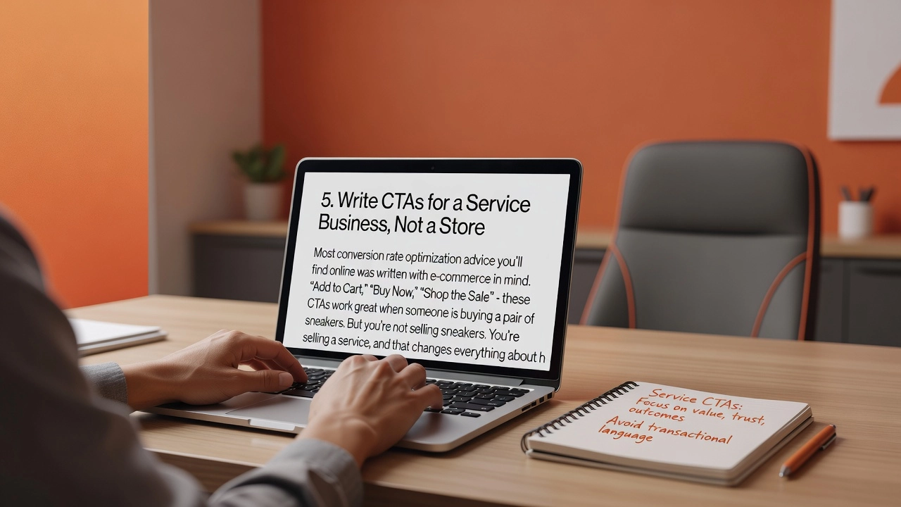
Most conversion rate optimization advice you’ll find online was written with e-commerce in mind. “Add to Cart,” “Buy Now,” “Shop the Sale” – these CTAs work great when someone is buying a pair of sneakers. But you’re not selling sneakers. You’re selling a service, and that changes everything about how your call-to-action needs to be written.
When someone considers hiring a plumber, a landscaper, or a marketing agency, they’re not making a one-time transaction. They’re entering a relationship. That creates what you might call commitment anxiety, and your CTA needs to dissolve that anxiety by making the first step feel small, safe, and specific.
The CTAs that actually work for service businesses are things like “Get a Free Quote,” “Book a 15-Minute Call,” “See If We Serve Your Area,” and “Request a Same-Day Estimate.” Notice what each of these does: it names exactly what happens next, and nothing about it implies you’ll be pressured into spending money. The scope is clear and bounded.
Button copy matters far more than button color, by the way. According to conversion research, a single word change in your CTA copy can shift conversions by 10 to 30%. First-person phrasing like “Get My Free Estimate” consistently outperforms second-person options like “Get Your Estimate” because “my” creates a sense of ownership and personal relevance for the visitor.
Each primary service page should have one dominant CTA, not two or three competing options. Place it above the fold and repeat it after your main content block. Too many choices creates hesitation, and hesitation kills conversions.
Finally, don’t overlook your phone number. Display it large and clickable in the top-right corner of every page header. A significant share of mobile visitors, who now represent over half your traffic, would rather tap to call than fill out a form.
6. Use Hyperlocal Social Proof to Build Immediate Relevance
Think about the last time you saw a testimonial that said “Amazing company, would definitely recommend!” Did it make you want to pick up the phone? Probably not. Now imagine reading: “They replaced our roof in Lincoln Park in just one day and left the yard spotless.” That second review does something the first one never could. It tells a nearby visitor that this business has worked in their neighborhood, with someone just like them. According to social proof research, 92% of consumers hesitate to buy when no reviews are available, and that hesitation drops dramatically when the proof feels personally relevant.
Beyond testimonials, embedding a live Google Maps widget on your contact page or homepage is a simple move that signals geographic legitimacy instantly. When visitors can see exactly where you operate, the mental friction of “but do they actually serve my area?” disappears before they even think to ask.
Displaying a live star rating pulled directly from your Google Business Profile adds another layer of credibility, because it is tied to a third-party system that visitors already trust. Static testimonials can feel curated; a live rating cannot. And research consistently shows that 87% of consumers will not consider a business rated below three stars.
Before-and-after photos tagged with specific locations, such as “Deck installation in Westfield Heights,” work as visual proof and hyperlocal trust signals simultaneously. Stock photography cannot replicate that.
Finally, if you cover multiple areas, dedicated service area pages give each neighborhood its own relevant landing experience, which improves both conversion rates and local search rankings after Google’s March 2025 proximity update placed heavier weight on geographic relevance signals.
7. Match Your Page Messaging to Where Visitors Come From
Not all website visitors are created equal, and treating them like they are is one of the most common conversion mistakes small business owners make.
Think about the difference in mindset between two visitors: one just searched “emergency plumber near me” at 11pm with a burst pipe, and another casually clicked a Facebook ad offering a seasonal HVAC tune-up discount. Both might land on your homepage, but one needs immediate help and the other is just browsing. Showing both visitors the exact same headline, the same hero image, and the same generic CTA wastes the urgency premium that high-intent traffic delivers.
This concept is called message match, and the data behind it is hard to ignore. Dedicated landing pages convert at a median of 4.02%, compared to just 2.35% for general website pages. That gap exists largely because focused, source-specific pages eliminate the mismatch between what earned the click and what the visitor actually sees.
At minimum, stop sending all your paid ad traffic to your homepage. Build a separate landing page for each campaign, with a headline that mirrors the ad copy directly. For organic search traffic, make sure your service pages lead with the specific service in the H1 and opening paragraph. Don’t bury it beneath a generic company introduction.
For those ready to go further, UTM-based dynamic text tools available in platforms like Webflow or Unbounce can shift your headline automatically based on traffic source, making personalized experiences a realistic option even for small teams with limited budgets.
8. Reduce Your Bounce Rate With Clear Next Steps
More than one in three visitors to a small business website leaves without clicking a single thing. That number sits around 37% for the average small business site, and the most common reason is not a bad product or a poorly designed page. It is simply that the visitor had no idea what to do next.
Every page on your site needs one visually obvious next step. Not three options, not a general menu, but one clear prompt that tells the visitor exactly where to go. On a homepage, that might be “Book a Free Consultation.” On a service page, it should be “Get a Free Quote.” On a blog post, it could be a link to the related service you just described. Nine proven fixes for reducing bounce rate in 2026 consistently point back to this same principle: ambiguity is the primary driver of single-page exits.
Internal linking is another practical fix that most small business owners overlook. When you link to related services, a project gallery, or a FAQ section directly within your page content, you give engaged visitors a natural path to keep exploring. These contextual links, placed inside your body copy rather than just in a navigation menu, are what move curious visitors deeper into your site.
Exit-intent popups are worth testing as well. These only appear when a visitor moves their cursor toward the back button, so they do not interrupt anyone who is still reading. A targeted offer like a free estimate or a short downloadable checklist can recover a portion of visitors who were about to leave. Note that this tactic works on desktop but does not translate to mobile touchscreens, where cursor movement does not apply.
Finally, open your analytics and sort your pages by bounce rate. Start with the worst performers and ask three questions: Is the page slow? Is the messaging vague? Is there a visible CTA? Fixing those pages first gives you the highest return on your time.
9. Connect Your Website to a Lead Follow-Up System
Getting a lead to fill out your contact form feels like a win, and it is, but it’s only half the battle. Here’s the part most small business owners don’t realize: 78% of customers end up buying from the first business that responds to their inquiry. The average business takes nearly 47 hours to reply to a new lead. By that point, your potential customer has already hired someone else.
This is why connecting your website to a proper lead follow-up system is one of the highest-leverage moves you can make. Tools like HubSpot, GoHighLevel, or Pipedrive integrate directly with your contact forms and booking widgets so that every submission is automatically logged, assigned, and triggered into a follow-up sequence without anyone manually checking an inbox. According to research on lead response time, slow follow-up is almost never a motivation problem; it’s a routing and systems problem. The fix is structural, not personal.
The moment someone submits a form, an automated text or email should fire back within minutes. Not a generic “we’ll be in touch” message, but something that confirms their request, sets a clear expectation, and ideally offers a direct booking link. That single touchpoint separates you from the majority of competitors who go silent for days.
You can take this even further by tracking lead behavior on your site and feeding that data into your CRM. If someone visited your “commercial HVAC” page four times before submitting a form, your follow-up should open with commercial HVAC, not a generic greeting. For small teams running lean, this kind of smart automation replicates the responsiveness of a full sales department without adding a single hire.
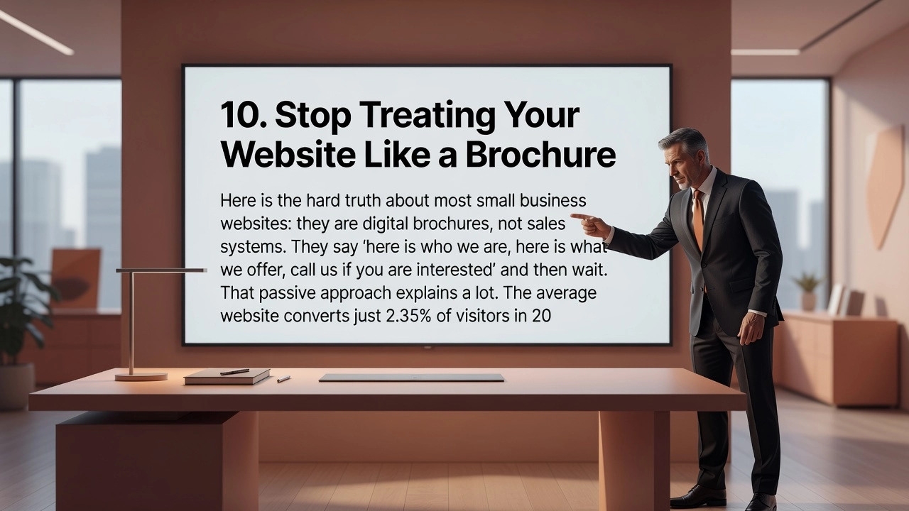
10. Stop Treating Your Website Like a Brochure
Here is the hard truth about most small business websites: they are digital brochures, not sales systems. They say “here is who we are, here is what we offer, call us if you are interested” and then wait. That passive approach explains a lot.
The average website converts just 2.35% of visitors in 2026. The top 10% of websites convert at 11.45% or higher. That is nearly a 5x performance gap, and research shows it is not explained by industry or ad budget. It is explained by whether the site actively guides visitors or simply displays information and hopes for the best.
A conversion-focused website does something fundamentally different. It acknowledges the visitor’s problem, presents a clear solution, and offers a low-risk first step, whether that is a free estimate, a quick callback, or a short consultation. It leads the visitor somewhere with purpose, rather than leaving them to wander.
The other major difference is maintenance. High-converting websites are never truly “finished.” Low-performing pages get revised headlines. CTAs get tested and updated. Testimonials from three years ago get replaced with reviews from last month. The site behaves like a living business asset, not a one-time project.
It is also worth remembering that CRO extends beyond your homepage. The blog post that brought someone to your site, the follow-up email they received, and the conversation your team has with them on a call are all part of the same system. Each touchpoint either builds on the conversion momentum your website created or quietly undermines it.
If your site was built once and has not been meaningfully updated since launch, it is almost certainly leaving leads on the table. You may not need a full redesign. You do need to start treating your website like the active, managed sales tool it should be.
Start With the Highest-Leverage Fix, Not a Full Redesign
Here is the most important thing to take away from everything you just read: you probably do not need to rebuild your website from scratch.
Most small business websites are not broken. They are just leaking in two or three specific places, and a full redesign would cost you thousands of dollars to fix problems that targeted improvements could solve in a fraction of the time and budget. The real move is a prioritized diagnostic: identify the highest-friction gaps, rank them by impact, and fix those first before touching anything else.
Use the ten tips in this post as your self-audit checklist. Go through each area, speed, mobile experience, trust signals, CTAs, social proof, messaging, and lead follow-up, and honestly score how close your current setup is to the standard described. The categories where you fall furthest short are where your conversion losses are hiding.
If you want a structured, outside perspective on why your site is pulling traffic but not generating leads, Trailzi’s Web Performance Path is built to do exactly that. It transforms underperforming small business websites into active lead generation assets without the cost of a traditional agency retainer.
The gap between a 2.35% converting site and a 5% or higher converting site is real, measurable, and absolutely closeable. The businesses that close it do not treat conversion as a one-time project. They treat it as an ongoing discipline, and that shift in mindset is where the results actually come from.
Conclusion
Your website has the potential to be your hardest-working salesperson, running 24/7 without taking a single break. The good news? You do not need a massive budget or technical expertise to make it happen.
Remember the core takeaways: clear calls-to-action guide visitors toward the next step, trust signals build the confidence needed to convert, simple and focused design removes friction, and compelling headlines grab attention before anything else does.
Small changes truly add up to big results. Start with just one or two tips from this list, test what works for your audience, and build from there.
Ready to stop leaving leads on the table? Pick one strategy from this post and implement it today. Your future customers are already searching for what you offer. Make sure your website is ready to welcome them.